File Manager > Extending Functionality
Customize File Details Drawer
Learn how to control the fields, layout, and width of the File Details drawer.
This feature is available since Webiny v5.38.2.
- how to hide unwanted fields
- how to control the width of the drawer
- how to control the width of the panes
- how to group fields into tabs
Overview
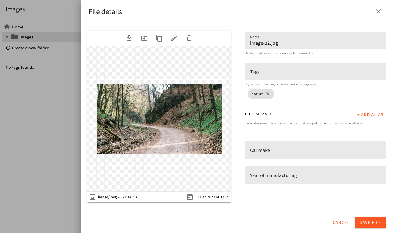
File Details drawer is a UI component which opens when you want to see or edit details of any particular file in the File Manager. By default, this drawer is set to be 1000px wide, and its content is split into two panes. The left pane shows the file preview and contextual actions (edit, delete, download, etc.). The right pane shows the file fields.
 File Details Drawer
File fields belong to one of the two categories:
- basic fields - built-in fields that are at the core of the File Manager
- extension fields - custom fields added via plugins
In the File Details drawer, these 2 field types are rendered one below the other, so the user immediately gets the full overview of all fields.
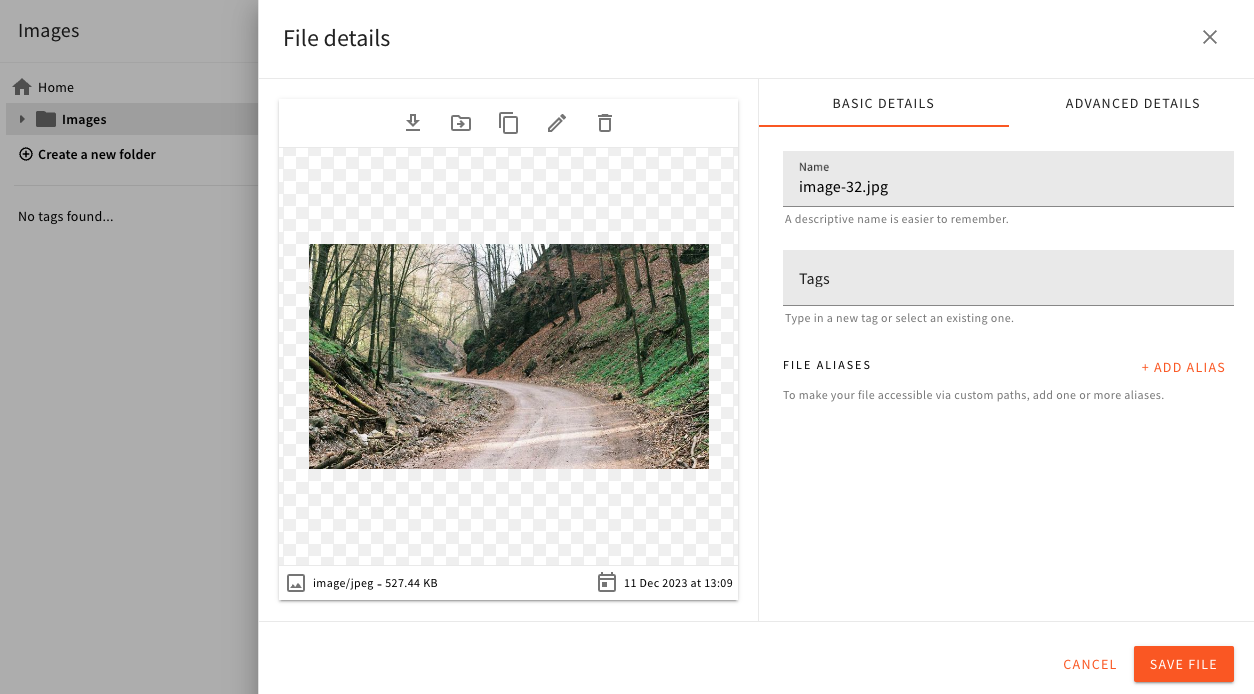
In the previous releases, these field categories were each displayed in their own tab. You can still achieve that via the config. Read on to learn how.
Using the Code Examples
The following code examples follow our usual configuration pattern. You need to add the code from
the examples to your apps/admin/src/App.tsx. Here’s an example:
In the following sections, we’ll only be showing the code that is related to the configuration of the File Manager. The rest of the code shown above will be omitted.
Hide Unwanted Fields
The built-in fields rendered in the File Details drawer are name, tags, and aliases. If you need to hide some of them, you can do it like this:
By removing fields from the UI, you’re only hiding the UI component. The data itself is still there, and it will be loaded from the API, and sent back to the API when you save your changes.
Width of the Drawer
The default width of the drawer is 1000px. You can change this by using the Width config component. The value can be anything supported by the CSS width property.
Width of the Content Panes
Changing the width of the drawer might be all you want to do. But if you need a more fine-grained control of the pane’s width within the drawer, you can use a more advanced value format:
The value you see in this example means the following:
- set the overall drawer width to 80% of the viewport
- set the left pane to
flex: 0.5 - set the right pane to
flex: 1
The panes are laid out using CSS Flexbox, so the second and third values are the values for the flex property. If you don’t specify any values for the panes, they default to
 1, which means equal width distribution.
Group Fields Into Tabs
In the previous releases, fields were grouped into Tabs by default. If that’s how you prefer to display them, you can enable that layout as follows:
This configuration will create tabs for basic fields, and extension fields:
 Grouping Fields into Tabs